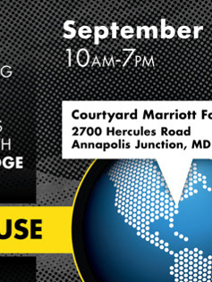
This is a redesign of G&B Solutions logo. The logos below represent multiple revisions with the client over the course of a couple of months. The plan was a complete rebranding starting with the logo. However, after nearly coming to a decision on the last logo displayed, G&B decided to stick with their current branding.

G&B Solutions current logo.
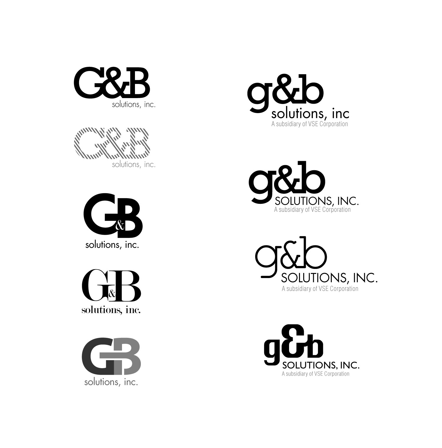
Initial Concepts
Typically I wouldn't include this many options for a client as they can get design overload. However, they were uncertain as to how they wanted to updated their logo so I decided to give them a variety of options so that they could react. I always start with creating black and white designs so the client reacts to the design and does not get hung up on color right away.

Color Iterations
Based on conversations back and forth, they liked the two designs from before and were interested in seeing something else as well. Can't say the bottom left is my best logo designed... but that's life. They then proceeded to downselect further to the left column designs. (Even the one I'm not proud of)
Based on conversations back and forth, they liked the two designs from before and were interested in seeing something else as well. Can't say the bottom left is my best logo designed... but that's life. They then proceeded to downselect further to the left column designs. (Even the one I'm not proud of)
The Finalists
G&B actually conducted an internal pole among employees to determine how they felt about the potential new logos. The two below were the highest scoring among 5 different logos.
G&B actually conducted an internal pole among employees to determine how they felt about the potential new logos. The two below were the highest scoring among 5 different logos.
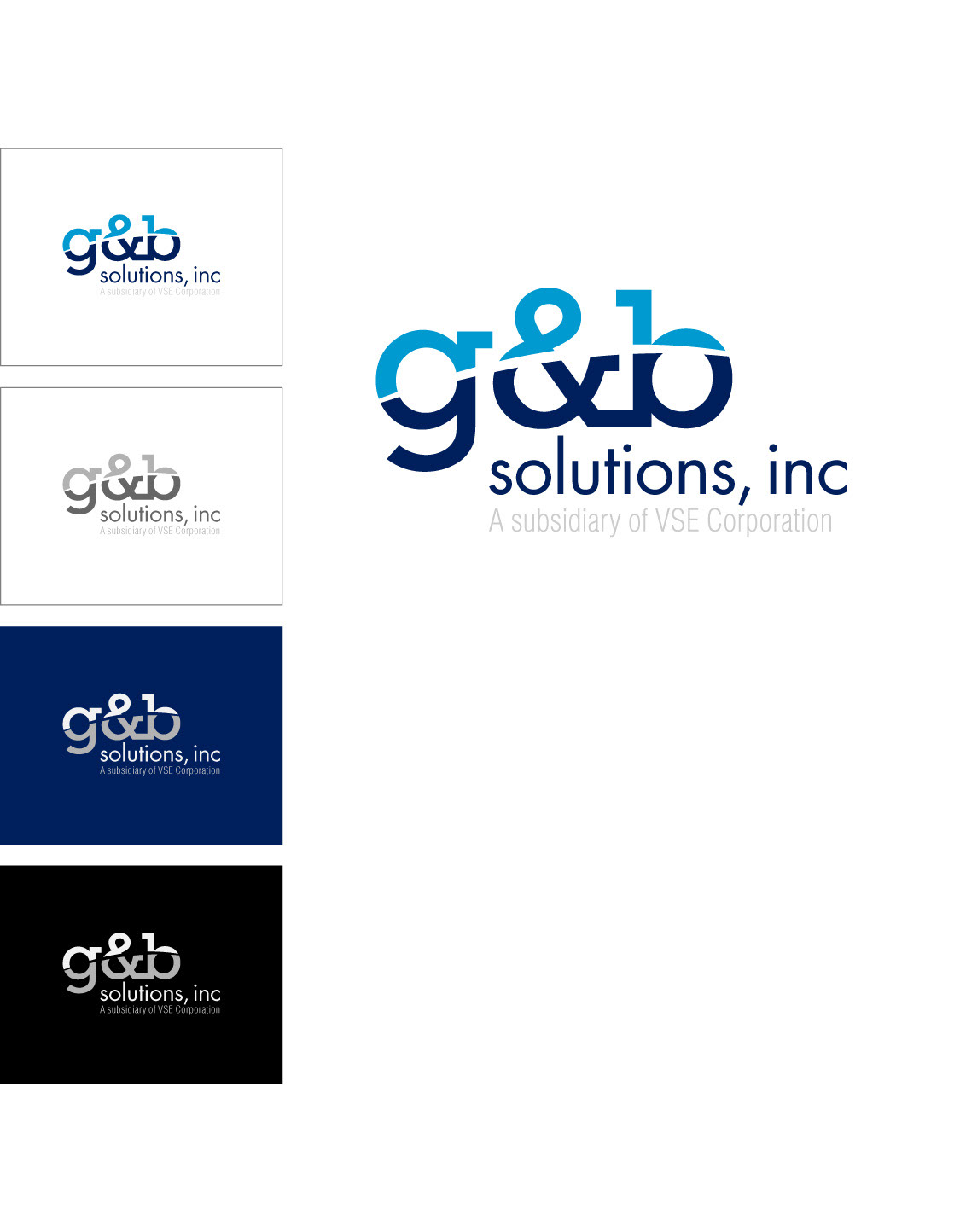
Top Scorer
This design scored best out of the five they chose to pole and was going to be the replacement logo until they decided to keep their current branding.
This design scored best out of the five they chose to pole and was going to be the replacement logo until they decided to keep their current branding.
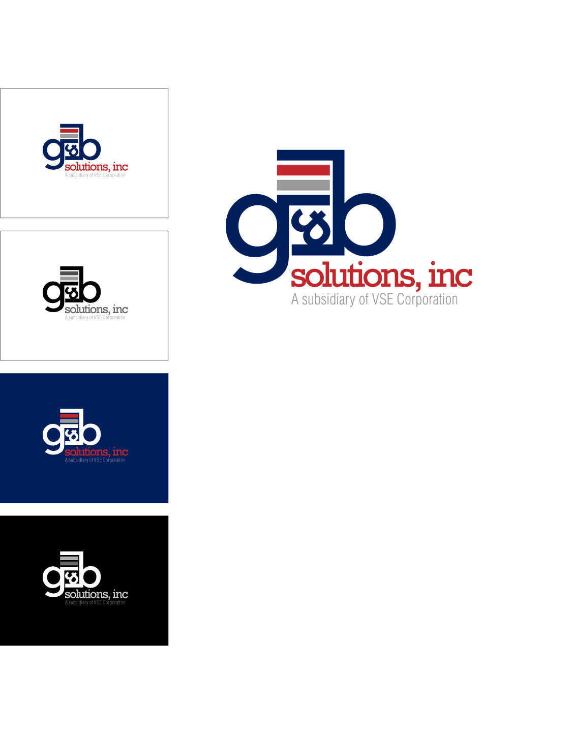
Runner-up
This design was second in the overall company opinion, but was considered to be too representative of architecture. My initial thinking behind it was structure, building, and IT server rack.

The Curve Ball
Before they were set on the design below, G&B asked me to take their existing logo and try to recreate it while maintaing the overall design. This was mostly for comparisons sake to put against the lowercase logo.
Before they were set on the design below, G&B asked me to take their existing logo and try to recreate it while maintaing the overall design. This was mostly for comparisons sake to put against the lowercase logo.
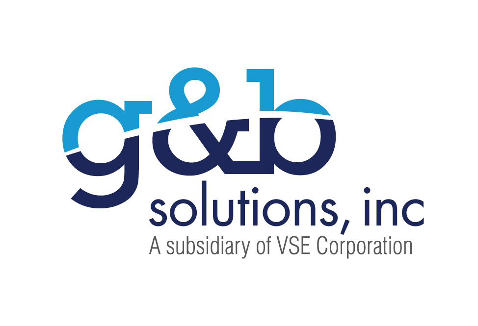
What Might have Been.
I'm not entirely sure why G&B decided to not rebrand. I do however understand that rebranding is a risky undertaking that impacts all levels of a company. It is a change of image and perception, if it is done poorly or thoughtlessly it can end in poor publicity, a loss of focus and distance consumers. I haven't gone into all of the reasons why I created the design and why I think it represents G&B. That was crafted from multiple emails, conversations and general impressions from existing materials, market understanding and who their end client is and what they are looking for in a company.
I'm not entirely sure why G&B decided to not rebrand. I do however understand that rebranding is a risky undertaking that impacts all levels of a company. It is a change of image and perception, if it is done poorly or thoughtlessly it can end in poor publicity, a loss of focus and distance consumers. I haven't gone into all of the reasons why I created the design and why I think it represents G&B. That was crafted from multiple emails, conversations and general impressions from existing materials, market understanding and who their end client is and what they are looking for in a company.